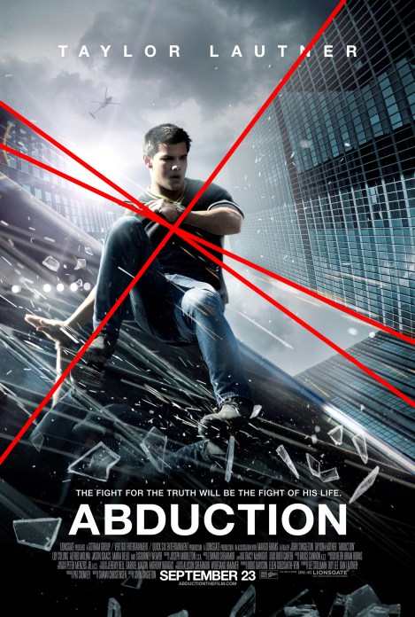
Well, of course I won’t be seeing this movie. What are you, an idiot? I think I accidentally saw the trailer and it looked terrible, and it really just seems to be the studio trying to cash in on the fact that this Taylor Lautner fellow was in Twilight, and this guy thinks he can have a career other than those movies. Hey, whatever a guy’s gotta do to make a living. I understand that this movie is for teenagers, so obviously I had no interest in it at all, but after spending some time looking at the poster, I now just hate everyone involved with making this movie. Before I go any further, take a look:
I guess it’s pretty typical of a shitty action movie aimed at teenagers. There’s a scene in the trailer involving this guy sliding down a glass window, so obviously they’ve incorporated those images, and arbitrarily threw more buildings into the background. Just so I don’t give the wrong idea, I have no sort of degree in art or any qualifications to judge graphic design, but I do remember an art class I had in high school about adding depth to scenes we drew. What you could do is add a “vanishing point” into the image, and as long as all horizontal lines “vanish” into that one point, BOOM, instant depth. I’m going to show you where the horizontal lines are headed in the poster, so we can try to figure out its vanishing point.
There are three obvious lines coming from two different buildings on opposite sides of the image, causing the vanishing point to be somewhere behind the actor. Still with me? Okay, good. Now let me point out two other important things in the image.
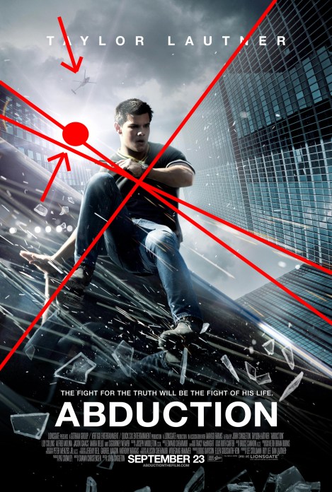
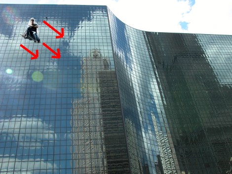
We have the underside of a helicopter, and we have a strong light source, which I’m assuming is the Sun. What does it all mean? Well, when you combine this information, the vanishing point, Sun, and helicopter this shows that the background of the image is intended to be the view of someone looking straight up. Who cares? Well, let’s take a look at the foreground image:
You can see that Lautner is traveling down the side of the building, which combined with the angle of the glass he’s sliding down, makes him appear to be sliding down and to the right. Seems pretty stupid, but why does this defy the laws of physics? Well, this means that, combined with the vanishing point, helicopter, and Sun, were we to look at this scene from a different angle, it would look something more like this:
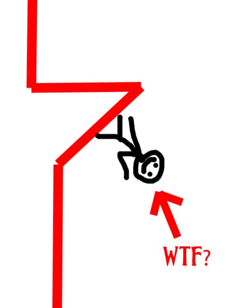
Doesn’t really seem to make any sense, does it? Also, let’s keep in mind that this is what he would be doing if the diagonal edge is the very top of the building. It couldn’t be the middle of the building, because we don’t see the rest of the building sticking up behind him. If it’s not the very top of the building, I suppose it could be part of the building that sticks out from the rest, and everything above the part of the building he is sliding on obstructs everything that extends higher above it. If that’s the case, the profile of the building would look like this:
Yes, this means that, given the composition of the background, combined with what’s going on in the foreground, it’s entirely possible that this individual is somehow effortlessly clinging, upside-down, to the sheer surface of the building, with more lateral motion than there are gravitational forces being exerted upon him. Is that the only answer? No, not at all! What else could all of this shit add up to? Oh, I don’t know, maybe EVERY FUCKING PERSON INVOLVED IN THIS PIECE OF SHIT MOVIE GAVE ABSOLUTELY ZERO FUCKS ABOUT HOW IT WAS MARKETED, AS LONG AS YOU HAD THE GUY FROM TWILIGHT DOING SOMETHING EXCITING IN THE FOREGROUND. I mean, I recognize the image in the foreground, since it’s from the trailer, and I understand that in the trailer he’s NOT defying gravity, so it seems someone just cropped, copied, and pasted that image on top of the Google results for “shiny buildings and a helicopter.” God-fucking-dammit. Why does this shit piss me off so much? Probably because the person responsible got paid more money for creating this one image, which negates both physics and artistic perception, than I will in a whole month. Hopefully, this lackadaisical approach to poster-making will convince everyone in the world to see anything other than this movie.


this was the best post ever/that is the worst trailer ever.
Coming from someone with your graphic prowess, this means a lot. I just hope my lack of technical terms wasn’t too cringe-worthy.
This is the best thing I’ve ever read.
I can’t have been the first one to notice these things. For the love of Cthulhu, I hope other people noticed this.
Peace..
1- Arts = NO limits
especially when its related to mind or physics laws! it’s art man!
2- but i still admit that its a great-creative post you made ;D
got it? 😀